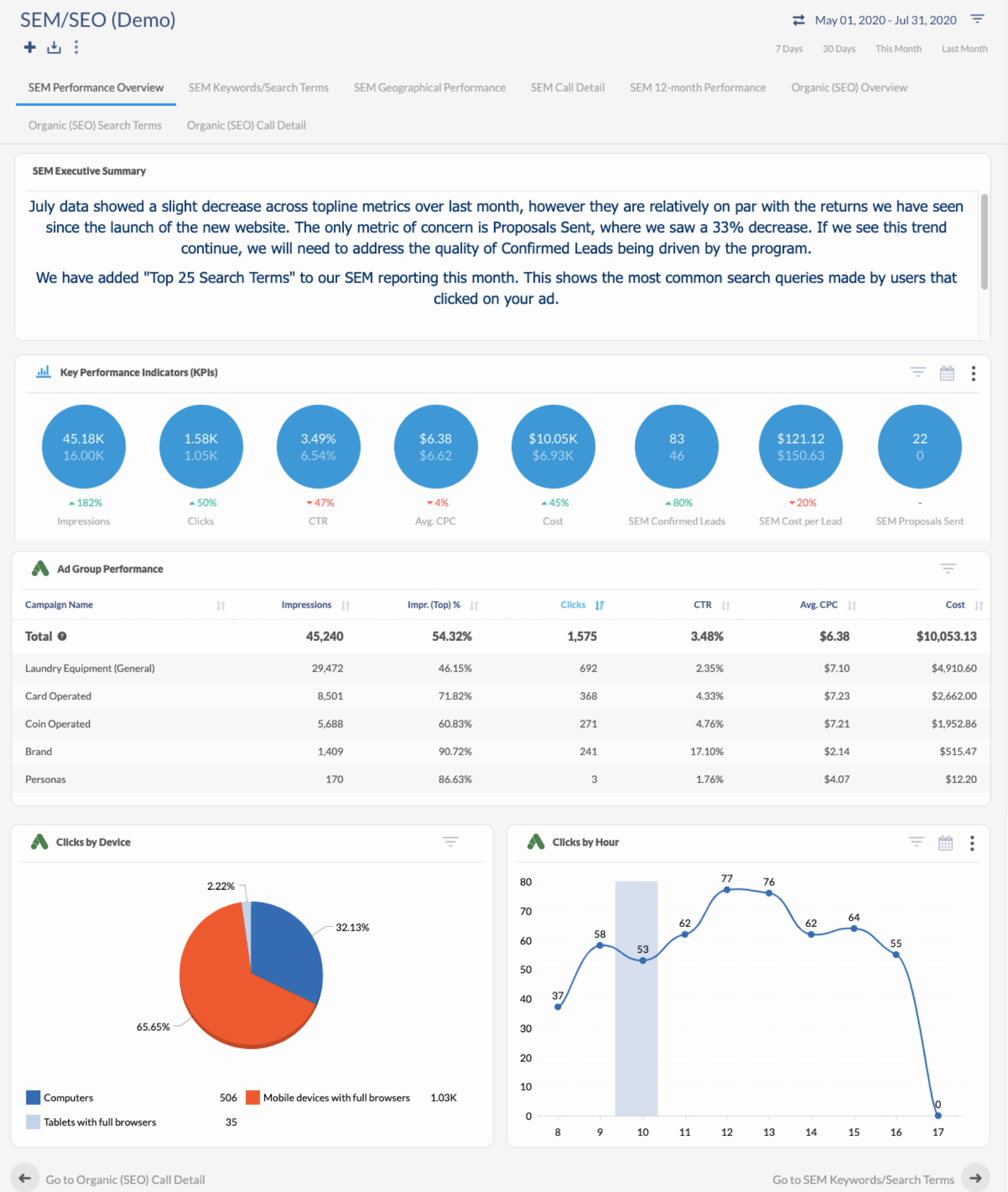
Reporting is an incredibly important indicator of success in marketing. As a marketer, chances are you’ve had to create a marketing report at some point in your career, and you’ve likely dealt with having to make them comprehensible to whomever oversees your marketing department. The truth is, marketing reports can be tricky to organize in a manner that makes sense to all audiences! DSG is not short on experience when it comes to reporting, so we have some tips to share for marketers looking to create reports that business owners and clients will understand.
Descriptive Titles
An easy to overlook detail that’s crucial to all marketing reports is the inclusion of a title. Be descriptive to ensure your audience understands the data that they’re looking at. Titles for each of the charts and data points throughout the report are equally important to the main title. Even though you may understand what a chart is showing without the inclusion of a title, others may not be so insightful. DSG’s rule of thumb is, should you find yourself questioning whether or not an element of your report would make sense to an outsider, always assume that more detail is likely needed. Additionally, don’t forget to include the time frame of the report (e.g. July 1-July 31, 2020).
Executive Summary
DSG suggests that every marketing report begins with an executive summary section. This brief paragraph is intended to quickly explain the KPI’s (key performance indicators) of the report. An executive summary gives an easy to understand quick look at the data in question, while the remainder of the report shows the information in greater detail. Think about an executive summary as your “data-story,” or the story that the data is telling us about data gaps, campaign errors, opportunities to optimize or invest. It’s also a good idea to keep your audience in mind during the creation of your report and executive summary. This will ensure that you speak their language and focus on the data that they will care about the most.
Visual Data
Make your data as visual as possible. Studies show that data visualizations are both easier to understand than written data, as well as more believable to the viewer. This will also trim down the time needed for the viewer to digest the data you’re presenting to them, helping your conference calls run smoother. Creating outlets to visualize data can also assist in telling a story with data, which is a great way to convey data over a large amount of time. Check out DSG’s blog on Telling a Story with Data for more tips.
Reporting Platforms
For a marketing report that will be reviewed repeatedly over time, it may be helpful to template out your report to make it easy to plug in new data at the end of each reporting period. Some platforms may even pull in data automatically, or offer advanced features such as automatic reports delivered directly to your inbox.

DSG uses an intuitive reporting platform that automatically produces beautiful and detailed reports like this one. The interface allows for quick and easy changes to the reporting period, and data widgets can be added and swapped out instantaneously. Data can be viewed in a variety of visual ways to suit your audience’s preferences, whether it be bar charts, line graphs, pie charts, or a number of other options, and plotting data against itself can help to pinpoint a precise cause and solution.
If you’re interested in taking advantage of DSG’s expert reporting capabilities, reach out using the contact form below. We would love to offer you a demonstration of all DSG has to offer!


